Make sure there’s water for the horse
We all know the old saying, you can take a horse to water, but you can’t make it drink. And it’s similar with websites. You can get people to your website, but you can’t make them buy or make contact. But you can have a huge impact on their decision making process, and by knowing a few tricks you can massively increase the chances of them buying from you.
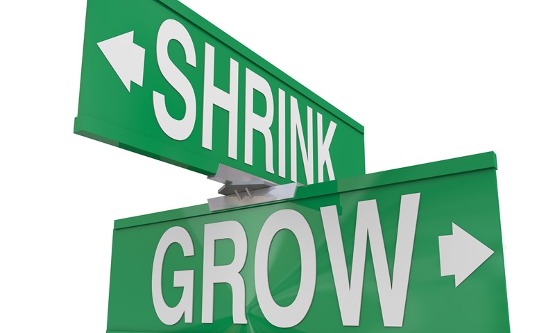
Introducing Conversion Optimisation
When we speak of a conversion on your website, we’re talking about one of your visitors taking a desired action. Now this action could be anything from someone signing up to your mailing list, requesting a quote or purchasing a product. It could be as simple as getting them to view your “Special Offer” page.
And if out of 100 visitors, one person “converts” then you have a conversion rate of 1%.
Now conversion optimisation is all about increasing that 1%. And although there are some obvious things you can do, there are a whole heap of things which aren’t obvious, but have a huge impact on the number of conversions your site achieves. And increasing conversions is going to increase leads, which is going to increase sales, which is going to grow your bottom line.
Increasing Conversions
The methodology to increase conversions is simple. Make it as easy as possible for people to buy from you:
-
Show that you understand and can solve their problems
-
Build trust
-
Make the steps to convert clear and easy
Show them that you understand and can solve their problems
Have you heard of the saying, sell benefits rather than sell features? Rather than talking about what your product does, you talk about how your product helps. And the smart websites take this to the next level by talking about your customers needs, wants and problems, and how your product can meet them. You show them that you understand them and build trust.
But you have to do it quickly – the average person spends just 3 seconds looking at your home page before deciding whether to stay, or leave.
Building Trust
You’ve got a number of different ways to build trust on your site, but whatever you do, you need to put it front and centre. Make sure it’s on your homepage, and is a key part of any pathway that a user takes through your site. Conversion tests have shown that having just a quote from a customer, even without their name let alone a photo, can increase the number of conversions on a page. Other ways to improve trust include:
-
A solid About Us page
-
Testimonials
-
Portfolios
-
Case Studies
-
Associations
-
Customers, especially well known customers
-
Pictures and bios of your staff.
-
Guarantees
So you’ve shown what you can do, you’ve built trust. Now it’s time to show them how and why to take action.
Make the steps to convert clear
It seems simple enough, but often things can get in the way of a good conversion.
Often the design itself can get in the way, and this often happens with social media icons. Designers like to design Facebook logos that blend in to the overall design of the site. But by making them less prominent, they also reduce the number of click throughs. Now I’m not saying that all designers have to immediately keep their social media button design true to the original – but I am saying that you need to take into consideration the impact the design will have on people’s ability to connect with you.
And colour too is critical. You may have heard back in the day that Red represents STOP and green represents GO! So you may want to get all your buttons designed with a green tint. Well STOP right there! Tests have shown that a red button will get clicked a heck of a lot more than a green button. So choose colours carefully.
And lastly language. How would you feel if I asked you to submit? If it doesn’t sound like your idea of fun, you’re not alone. In fact adding a “Submit” button to a contact form is the quickest way to subconsciously turn away customers. But adding a button which says “Get my quote now” or “Make Contact” or “Begin” is much more action inspiring and will increase conversions.
If the above all sounds like some kind of airy fairly guess work I can understand. I thought the same, until I heard about.....
A/B Testing and the joy of knowing what really works
There are now tools that you can plugin into your website to measure what people are doing. And there are tools that can test out a number of different versions of your page and see what works out there in the real world.
As an example, let’s say you create a Red “Contact Us” button (let’s call this version A) and a Green “Contact Us” button (version B). You set up the software and it begins showing each new visitor a different version, and measuring the results. At the end of 1000 visits, each version will have been shown 500 times. And the software will be able to tell you which version gets the most clicks.
And although there are certainly trends, every test can show different results. Remember to measure and review regularly.
Pulling it all together
So get going and make sure that you’re talking your customer’s language. Add your trust elements, and then make sure that the path for your customers is clear. And then start measuring. By measuring you’ll be able to see what is working, and what isn’t working. Find the holes, and fill ‘em. And you’ll be on your way to building and maintaining a high converting website.
Looking to improve your website but not sure where to start? Get in touch to get your free consultation.
Want more from your website?
Get practical, easy to implement guidance and tips to accelerate your online performance with a personalised one on one phone consultation


 Clarity First: A Smarter Way to Approach SEO
 The Risks of Having An Out of Date Website
 How to Use Marketing Buyer Personas to Improve the Effectiveness of Your Website